Understanding Color Through Harmony

How The Method Works
Color harmony is shaped by three natural forces.
TSTone : Clear → Soft
Depth : Light → Deep
Temperature : Warm → Cool
These forces create seven harmony spectrums
Clear • Deep • Light • Soft • Warm • Cool • Fresh
Fresh is the balanced bridge within the harmony system
The Color Harmony Method
is a modern framework for understanding personal color
through the natural forces
that shape harmony.nt
Why Color Analysis Often Leaves People Confused
For decades, color analysis has focused on categories.
Spring.
Summer.
Autumn.
Winter.
Later, tonal systems attempted to simplify things by focusing on qualities like light, deep, warm, cool, clear, and soft.
These ideas were strongly influenced by the work of Albert Munsell, whose color theory explored how hue, value, and chroma interact to create harmony.
These tonal approaches helped bring greater clarity to color analysis and form an important foundation of the Color Harmony Method.
Yet even within these systems, an important relationship in color remained largely unrecognised.
But many people still found themselves asking the same question:
Why don’t these categories always make sense?
The answer lies in something both systems overlooked.
The Missing Link in Color Analysis
Traditional seasonal systems focused primarily on temperature — warm and cool.
Later tonal systems explored other qualities such as light, deep, clear, and soft.
But an important relationship within color was still missing.
Blended tertiary colors — the subtle mixtures created when colours interact naturally — were rarely recognised as their own distinct harmony relationship.
Within the Color Harmony Method, this balanced relationship is called Fresh.
When Fresh is included, the system finally becomes complete.
The Harmony Philosophy
Most color systems focus on labelling people.
You are placed into a category and given a palette to follow.
But a label alone doesn’t always help people understand why certain colors work.
The Color Harmony Method takes a different approach.
Instead of simply assigning a category, you learn to recognize how color harmony actually works.
By understanding the forces that shape color - tone, depth, and temperature - harmony becomes something you can see and apply naturally.
Rather than telling you what you are, the Harmony Method shows you where your natural harmony sits.
The goal is to help you develop an eye for harmony, so your color spectrum has meaning and understanding.
You begin to see how and why certain colors bring your natural harmony to life.
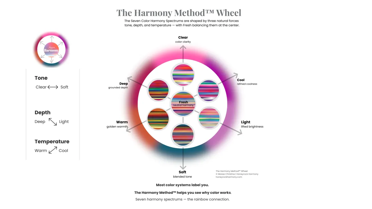
Color Harmony Is Shaped by Three Natural Forces
Instead of forcing people into rigid categories, the Harmony Method looks at the natural forces that shape how color behaves.
Three forces influence every color palette.
Tone:
Clear → Soft
Depth:
Light → Deep
Temperature:
Warm → Cool
These forces interact constantly in real-world color.
When they combine in different ways, they create distinct expressions of harmony.
🌈 The Harmony Wheel
The Harmony Method visualizes these relationships through the Harmony Wheel.
Each spectrum represents a different balance of tone, depth, and temperature.
Clear sits opposite Soft.
Light balances Deep.
Warm balances Cool.
At the center sits Fresh — a balanced spectrum that bridges the others.
Rather than placing people into rigid labels, the Harmony Wheel helps reveal how color relationships actually work.
🌈The 7 Color Harmony Spectrums
When the three color forces interact, they create seven distinct expressions of color harmony.
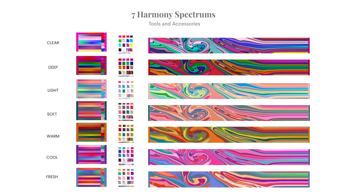
Each spectrum reflects a different balance of color energy, depth, and temperature.
Most people feel naturally at home in one spectrum, while others can borrow from neighboring harmonies.
Understanding these spectrums helps people see how color works across the entire palette.This is a ParagraphFon
Developing an Eye for Harmony
The goal of the Color Harmony Method is not to label people.
It’s to help them see color clearly.
When you begin to recognize how tone, depth, and temperature interact, choosing color becomes intuitive.
Wardrobes begin to work together.
Color combinations feel natural.
Confidence grows.
And that’s when color finally clicks.
Harmony Beyond Color
While the Color Harmony Method begins with color, harmony extends beyond color alone.
The same principles that shape color harmony also influence how we create balance in clothing, contrast in outfits, and visual harmony in personal style.
This broader perspective becomes Style Harmony.
Where color, contrast, and design work together to create a complete and balanced personal expression.
Color harmony is the foundation of personal style.
Style Harmony
Coming soon for Honeyrock Harmony graduates.
Next Step
If you’d like to experience the Harmony Method for yourself, begin with the Harmony Breakthrough.
A short guided introduction to the 7 Color Harmony Spectrums.
For stylists, consultants, and creatives ready to teach color:
Explore the Color Harmony Method Coach Certification →
Honeyrock Harmony
Home of the Color Harmony Method™
Color Analysis 2.0
Beyond Seasons.
Into Harmony.
Helping people see color harmony clearly.
Learn
Harmony Breakthrough
Color Consultation
Coach Certification
Connect
Contact
Instagram
Pinterest
YouTube
Color harmony isn’t a category.
It’s a relationship.
© 2026 Honeyrock Harmony | The Color Harmony Method™ is the intellectual property of Maree Christine.